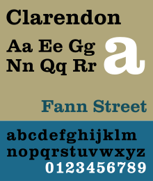
Clarendon (typeface)
 | |
| Category | Serif |
|---|---|
| Classification | Slab serif |
| Designer(s) | Robert Besley |
| Foundry | Fann Street (Show all characters) |
| Date released | 1845 |
Clarendon is the name of a slab serif typeface that was released in 1845 by Thorowgood and Co. (or Thorowgood and Besley) of London, a letter foundry often known as the Fann Street Foundry. The original Clarendon design is credited to Robert Besley, a partner in the foundry, and was originally engraved by punchcutter Benjamin Fox, who may also have contributed to its design. Many copies, adaptations and revivals have been released, becoming almost an entire genre of type design.
Clarendon has a bold, solid structure, similar in letter structure to the "modern" serif typefaces popular in the nineteenth century for body text (for instance showing an 'R' with a curled leg, and ball terminals on the 'a' and 'c'), but bolder and with less contrast in stroke weight. Clarendon designs generally have a structure with bracketed serifs, which become larger as they reach the main stroke of the letter. Mitja Miklavčič describes the basic features of Clarendon designs (and ones labelled Ionic, often quite similar) as: "plain and sturdy nature, strong bracketed serifs, vertical stress, large x-height, short ascenders and descenders, typeface with little contrast" and supports Nicolete Gray's description of them as a "cross between the roman [general-purpose body text type] and slab serif model". Gray notes that nineteenth-century Ionic and Clarendon faces have "a definite differentiation between the thick and the thin strokes", unlike some other more geometric slab-serifs.
Slab serif typefaces had become popular in British lettering and printing over the previous thirty-five years before the original Clarendon's release, both for display use on signage, architectural lettering and posters and for emphasis within a block of text. The Clarendon design was immediately very popular and was rapidly copied by other foundries to become in effect an entire genre of type design. Clarendon fonts proved extremely popular in many parts of the world, in particular for display applications such as posters printed with wood type. They are therefore commonly associated with wanted posters and the American Old West. A revival of interest took place in the post-war period: Jonathan Hoefler comments that "some of the best and most significant Clarendons are twentieth century designs" and highlights the Haas and Stempel foundry's bold, wide Clarendon display face as "a classic that for many people is the epitome of the Clarendon style."
Background

Slab serif lettering and typefaces originated in Britain in the early nineteenth century, at a time of rapid development of new, bolder typefaces for posters and commercial printing. Probably the first slab-serif to appear in print was created by the foundry of Vincent Figgins, and given the name "antique". Others rapidly appeared, using names such as "Ionic" and "Egyptian", which had also been used as a name for sans-serifs. (At the time typeface names were often adjectives, often with little purpose to their name, although they may have been in this case reference to the "blocky", geometric structure of ancient architecture. There was limited separation between the name of typefaces and genres; if a font proved popular it would often be pirated and reissued by other foundries under the same name.)
Compared to Figgins' "antique", the Clarendon design uses somewhat less emphatic serifs, which are bracketed rather than solid blocks, that widen as they reach the main stroke of the letter. Besley's design was not the first font with this style by at least three years, as typefaces labelled "Ionic" had already appeared in this style (other typefaces would copy this name), but the Clarendon design was particularly popular and its name rapidly copied. Historian James Mosley suggests that an inspiration for these designs may have been the style of handlettered capitals used by copper-plate engravers.

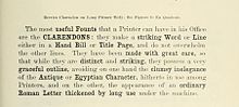
Besley's original Clarendon design was quite compressed, unlike most later 'Clarendons' intended for display setting, which are often quite wide. One of the original target markets for Besley's Clarendon design was to act as a bold face within body text, providing a stronger emphasis than the italic type that had been used for centuries for this purpose, and in this it matches the quite condensed body text faces of the period. (The modern system of issuing typefaces in families with a companion bold of matched design did not develop until the twentieth century.) Slab serifs had already begun to be used for bold type by the 1840s, but they were often quite lumpy in design and quite poorly matched to the body text face they were intended to complement. Mosley has written that "the Clarendon type of the Besley foundry is indeed the first type actually designed as a 'related bold' – that is, made to harmonize in design and align with the roman types [regular weight typefaces] it was set with...Before the launch of Clarendon type printers picked out words in slab-serifs or any other heavy type." However, because of the Clarendon design's strong reputation for quality, it was rapidly copied. Historian Nicolete Gray considered the earlier "Ionic" face from the Caslon Foundry in the same style more effective than Besley's: "[Besley's] became the normal, but it was certainly not the first…in 1842 Caslon have an upper and in 1843 a lower case with the characteristics fully developed, but of a normal width…Besley's [more compressed] Clarendon is much less pleasing, it has lost emphasis and confidence, and gains only in plausibility."

Besley registered the typeface in 1845 under Britain's Ornamental Designs Act of 1842. The patent expired three years later, and other foundries quickly copied it. Besley was nonetheless successful in business, and became the Lord Mayor of London in 1869. Theodore De Vinne, a printer who wrote several influential textbooks on typography in the late nineteenth century, wrote that its name was a reference to the Clarendon Press in Oxford (now part of Oxford University Press), who he claimed immediately used it for dictionaries, although later authors have expressed doubt about this.
With its growing popularity for display use, new versions often changed these proportions. By around 1874, the Fann Street Foundry (now Reed and Fox) could offer in its specimen book Clarendon designs that were condensed, "thin-faced" (light weight), extended, "distended" (extra-wide) and shaded. Revivals continued in the twentieth century, particularly in the 1950s.
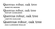
The label "Ionic", originally also used for display faces, has become associated with typefaces with some Clarendon/slab-serif features but intended for body text, following the success of several faces with this name from first Miller & Richard (intended to be slightly bolder than contemporary expectations for body text proportions) and then Linotype (its 1922 release Ionic No. 5, extremely successful in newspaper printing). Millington notes that "Ionic became a distinct design in its own right" while Hoefler comments that it is now "chiefly associated with bracketed faces of the Century model". A decline of interest in Clarendons for display use did, however, take place in the early twentieth century: by 1923, American Type Founders, which specialised in creating demand for new designs of display face, could argue "Who remembers the Clarendons[?]" in its specimen book, and did not show them (aside from some numerals) in its 1,148 pages. In addition, the market of slab serifs was disrupted by the arrival of new "geometric" slab-serifs inspired by the sans-serifs of the period, such as Beton and Memphis. However, a revival of interest did appear after the war both in America and Europe: Vivian Ridler commented that "What seemed pestiferous thirty years ago is now regarded as rugged, virile and essential for an advertising agency's self-respect."
Revivals
A variety of Clarendon revivals have been made since the original design, often adapting the design to different widths and weights. The original Clarendon design, a quite condensed design, did not feature an italic, and many early Clarendon designs, such as wood type headline faces, have capitals only with no lower-case letters, leaving many options for individual adaptation.
The original Clarendon became the property of Stephenson Blake in 1906, who marketed a release named Consort, cutting some additional weights (a bold and italics) in the 1950s. The original materials were transferred to the Type Museum collection when Stephenson Blake left the printing business in 1996. Designs for wood type copying Clarendon were made from the mid-1840s onwards.
Most hot metal typesetting companies offered some kind of slab serif; Linotype offered it duplexed to a Roman type so that it could be easily switched in for emphasis. The typeface was reworked by Monotype, with a redesigned release as "New Clarendon" in 1960. Hermann Eidenbenz cut a version, in the early 1950s, issued by Haas and Stempel, and later, Linotype. Freeman Craw drew the Craw Clarendon family, a once popular American version, released by American Type Founders, in 1955, with light, bold and condensed variants.

Aldo Novarese drew the Egizio family for Nebiolo, in Turin, Italy. The design included matching italics. David Berlow, of the Font Bureau, released a revival as Belizio in 1998. The Clarendon Text family, with italics inspired by Egizio, was released by Patrick Griffin of Canada Type.
Volta, sold as Fortune in the U.S., a modern view of Clarendon, was designed by Konrad Friedrich Bauer and Walter Baum for the Bauer Type Foundry in 1955.
Ray Larabie, of Typodermic, released the Superclarendon family in 2007, using obliques instead of italics. A wide, display-oriented design with small caps and Greek and Cyrillic support, it is bundled with macOS.
Sentinel, from Hoefler & Frere-Jones, another typeface family based on Clarendon with italics added, was released in 2009. Intended to have less eccentric italics suitable for body text use, it was featured heavily in President Barack Obama's 2012 campaign website advertisements.
Besley* from Indestructible Type is an open-source revival with variable font versions.
French Clarendon


In the late nineteenth century the basic Clarendon face was radically altered by foundries in the United States, resulting in the production of the 'French Clarendon' type style, which had enlarged block serifs at top and bottom. This style is also traditionally associated with wild-west printing; it is commonly seen on circus posters and wanted notices in western movies. However, it was actually used in many parts of the world at the time.
The concept, now called as reverse-contrast or reverse-stress type, predated Clarendon altogether. It began, possibly around 1821 in Britain, as a parody of the elegant Didone types of the period. It was created by inverting the contrast of these designs, making the thin strokes thick and the thick strokes thin. The result was a slab serif design because of the serifs becoming thick. (In the 19th century, these designs were called Italian because of their exotic appearance, but this name is problematic since the designs have no clear connection with Italy; they do slightly resemble capitalis rustica Roman writing, but this may be a coincidence. For similar reasons they were also called Egyptian or Reversed Egyptian, Egyptian being an equally arbitrary name for slab serifs of the period.)
Intended as attention-grabbing novelty display designs rather than as serious choices for body text, within four years of their introduction the printer Thomas Curson Hansard had described them as 'typographic monstrosities'. Derivatives of this style persisted, and the concept of very thick serifs ultimately merged with the Clarendon genre of type. The advantage of French-Clarendon type was that it allowed very large, eye-catching serifs while the letters remained narrow, suiting the desire of poster-makers for condensed but very bold type. Fine printers were less impressed by it: DeVinne commented in 1902 that "To be hated, it needs but to be seen."
Because of their quirky, unusual design, lighter and hand-drawn versions of the style were popular for uses such as film posters in the 1950s and 60s. A variety of adaptations have been made of the style, Robert Harling's Playbill and more recently Adrian Frutiger's Westside, URW++'s Zirkus and Bitstream's P. T. Barnum.
A radically different approach has been that of Trilby by David Jonathan Ross, who has written on the history of the genre. Released by Font Bureau, it is a modernisation reminiscent of Clarendon revivals from the 1950s. It attempts to adapt the style to use in a much wider range of settings, going so far as to be usable for body text.
Terminology
The following terms have been used for Clarendons and related slab serifs. Common meanings have been added, but they have often not been consistently applied. Many modern writers as a result ignore them and prefer the term slab-serif, providing individual descriptions of the features of specific designs.
- Clarendon - often particularly used to refer to slab-serifs with 'bracketed' serifs.
- Antique - the first name used for slab-serifs, but in France often used for sans-serifs. Sometimes taken to mean slab-serifs in the nineteenth-century style with Didone letterforms and thick, square slab-serifs.
- Egyptian/Egyptienne - mostly used for slab-serifs generally, although first used by the Caslon Foundry in naming their sans-serif, the first made. Continued to be used as a name for "geometric" slab-serifs appearing in the twentieth century, and so several geometric slab-serifs had Egyptian-themed names, including Memphis, Cairo and Karnak.
- Ionic - in the nineteenth century used as a name for slab-serifs. In the twentieth century this term became used to mean text faces with some Clarendon-style features, because of an influential body text face of this name from Linotype - this followed from previous faces of the same name only slightly bolder than text proportions from Miller & Richard.
Appearances


Craw Clarendon Bold was used by the United States National Park Service on traffic signs, but has been replaced by NPS Rawlinson Roadway. A heavy bold Clarendon variant was used for the cast brass locomotive nameplates of the Great Western Railway. This was however drawn within the Swindon drawing office, not by a type foundry, and this 'Swindon Egyptian' differed in some aspects, most obviously the numerals used for the cabside numberplates. The typeface is currently used by Public Transport Company (Polish: Miejskie Przedsiębiorstwo Komunikacyjne, abbreviated MPK) in Poznań (Poland) as the typeface of fleet vehicles' numbering, and on trams for displaying the route number.
A custom variation of the typeface is used to display dollar amounts and other lettering on Wheel of Fortune's wheel.
In logos
Versions of Clarendon can be seen in the logotypes of brands such as:
- Japanese corporations Sony, Honda, Tamiya, and Onkyo
- Älvsbyhus, a Swedish house manufacturer
- APL, a programming language developed in 1966
- Dave, a channel on UKTV
- El País, a Spanish newspaper
- Pitchfork, an American online publication
- Ranbaxy, an Indian pharmaceutical company
- Three Twins, an American ice cream company
- Wells Fargo, a financial services company
- The official 1961 Marvel Comics logo
- Some pharmaceutical companies in Bandung, such as Sanbe (either in company logo or on prescription medicine package)